|
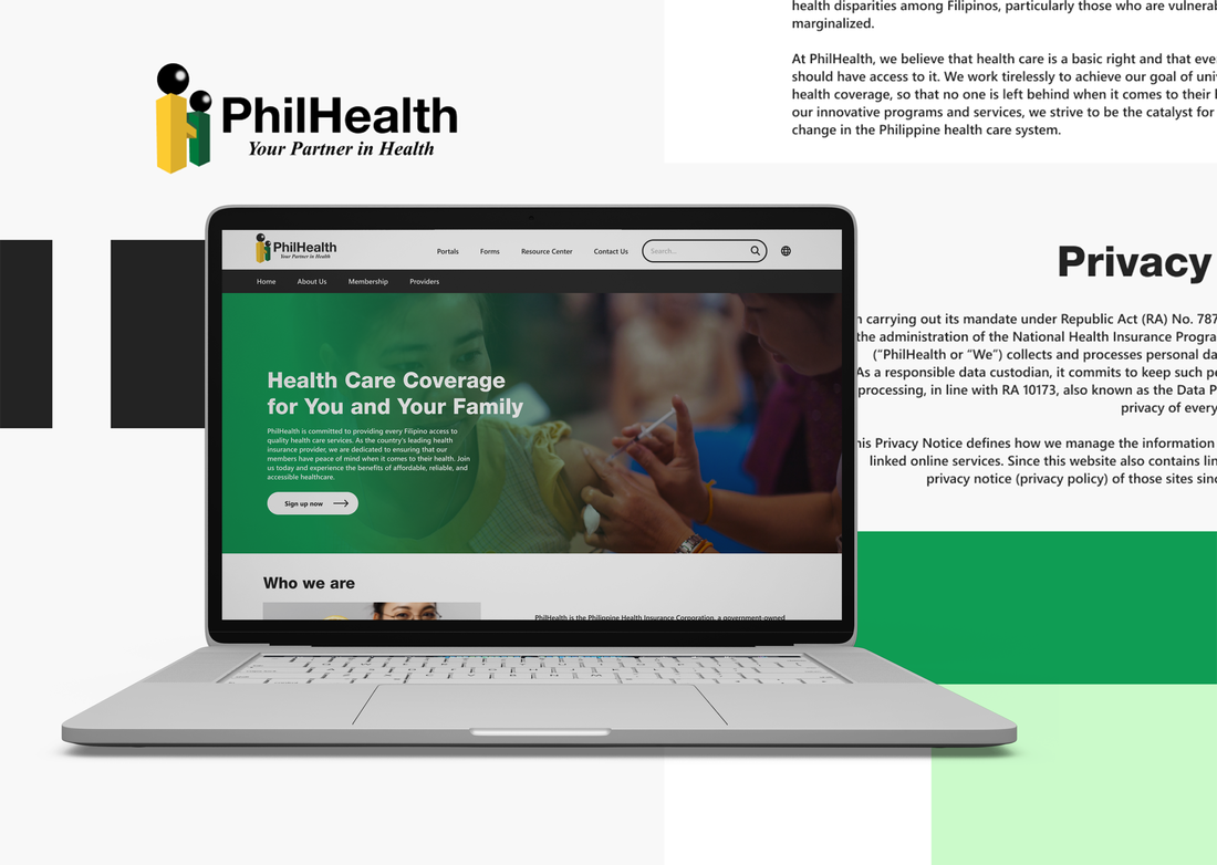
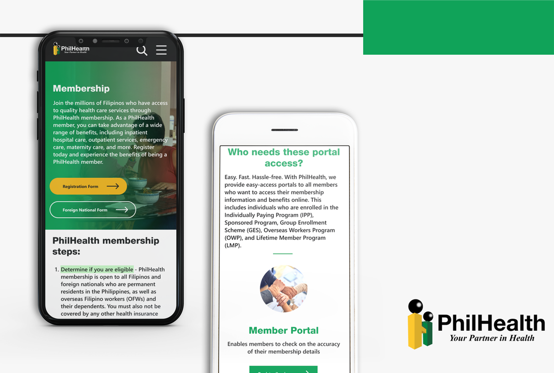
The webpage for PhilHealth is old. Like, really old. The UI is too outdated for a website that many people in this country rely on for health insurance. The menu is not intuitive. You want your links to be visible and clear so that our users know what to click on. Another thing is the search bar. It's not visible. It barely works, and it doesn't draw the user's eye towards it. This is a major problem since much of the userbase consists of users in their 40's to 60's. There isn't even a mobile version of the site!
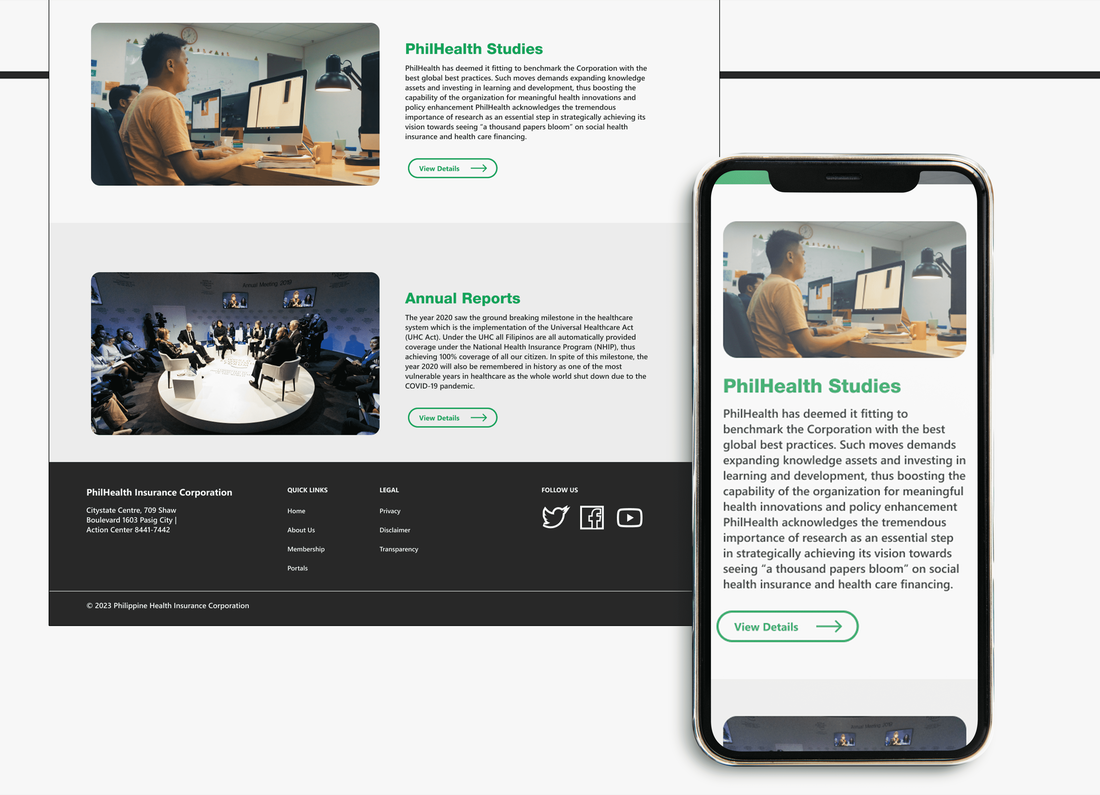
PhilHealth’s redesign is clear and straightforward. The homepage has a featured image in the hero section with a call-to-action (CTA) button. It follows a Z- pattern. The color contrast with the sections and buttons stands out against the background, so it’s clear what actions users take when they arrive. Sub-navigation section is well-categorized. There's an option to switch to either a filipino or english verison of the site. The photography should capture the lives of Filipinos whether they are families, babies, moms, & dads. These are layered with human context, approachability, & warmth. The photography should reflect this reassurance that PhilHealth brings to every Filipino. Focus more on the evocation and feeling rather than in a medical setting. The UI elements and colors are updated. Made in Figma. |
|
|
hazel cooper pasco is exploring virtual experiences, storytelling and the online life.
|
Twitter
|
